Considering Color...
Color-Why?
http://www.wetcanvas.com/ArtSchool/Color/ColorTheory/Lesson1/index.html
2/20/09
Sketchbook
The artist Fernand Leger said that "Colour is a human need, like
water and fire. It is a raw material indispensable to life." Investigate the truth of this
statement in your sketchbook. Write a page responding to this statement. Some research may be necessary.
How does color fit in with your major? What will you use it for? Why do you have to know about it?
Do color schemes change depending on where you live? How about the era you live?
How about eyesight and its effects on color?
Is there too much color in the world today?
Part of being inundated with color is that most of our movies are in color unlike when movies began. How do you feel when you are watching a black and white movie?
Do you get impatient with it?
How about photos and films of war? Would the psychological impact on viewers be different?
What is the relation between color and reality? Does color make things more real or genuine or are their occurrences in our world that would seem more authentic in black and white?
Can you think of anything that should be viewed in black and white and not in color?
1/23/09
Sketchbook
Are their any paintings that you can think of that would benefit from being painted in a gray scale? Make copies of a painting printed in color and in black and white. Paste them into your color sketchbooks and state why you think the painting would benefit from being painted in a gray scale.
The Three Principles of Color
“No doubt there are a thousand different ways of working with color, but when one composes with it, like a musician with harmonies, it is simply a question of emphasizing the differences.” - Matisse
Hue
The quality that distinguishes one color family from another, as red from yellow or green from blue
• Hue and color are not synonyms.
Hue has only one dimension, color has three: hue, value and chroma.
Value
The quality by which a light color is distinguished from a dark one
• Lightness of a color depends on the percentage of light reflected from the colored surface (lightest is white- most light is reflected, darkest is pitch black- no light is reflected. Gray- some light is partially absorbed, and partly reflected).
• Often referred to as Tints or Shades
Tint- a light color
Paint- color mixed with white paint
Watercolor- color diluted with water
Print- color made from widely placed dots (halftone)
Science- color mixed with white light
Computer- in the monitor three electron beams simulate red, blue and green phosphors to glow, tinting happens when all three beams are set comparatively high
Shade- may indicate any dark color, or any color mixed with black
• Only a small amount of white paint needs to be added to make the black paint much lighter and takes a much larger amount of white paint to make a light gray appear much lighter.
Chroma
The strength or intensity of a color, the quality by which we distinguish a strong color from a weak or dull one, the amount of departure of a color from a gray of the same degree of lightness
Chroma involves the intensity and purity level in a hue that can range from fully saturated to infinite levels of neutrality.
• Neutralized or grayish colors show weak (LOW) chroma
• Intense colors show strong (HIGH) chroma
• Painters use the term saturation to indicate the relative proportion of pigment to filler, or medium, in paint.
• A saturated color is one with a strong chroma
• Easy to confuse chroma and value
With chroma it is possible to have a series of colors that gradually become grayer, without becoming darker
Primary Colors
Red Yellow Blue
Secondary Colors
Yellow + Red = Orange
Yellow + Blue = Green
Red + Blue = Violet
Tertiary Colors
Red + Orange = Red Orange
Orange + Yellow = Yellow Orange
Yellow + Green = Yellow Green
Green + Blue = Blue Green
Blue + Violet = Blue Violet
Violet + Red = Red Violet
Friday, February 20, 2009
Wednesday, January 21, 2009
Munsell and Itten

Albert Munsell
Closer view:

Two versions of Munsell Notation Wheel:


More information on Munsell system and products:
http://www.xrite.com/worldwide.aspx
Johannes Itten
Closer view:


Johannes Itten - The Art of Color
by Sarah Van Arsdale with The Sheffield School of Interior Design
http://www.dezignare.com/newsletter/Johannes_Itten.html
Hue
Color Mixing
• Hue and color are not synonyms.
Hue has only one dimension, color has three: hue, value and chroma.
Munsell system: 10 basic hue families: 5 major and 5 minor
Major hue families: Red, Yellow, Green, Blue, and Purple
Minor hue families: Yellow-Red (Orange), Green-Yellow, Blue-Green, Purple-Blue, and Red-Purple
• Hue circle- In the Munsell system this is what the circle of hues is referred to as, rather than the color wheel.
• Munsell notation for hue:
The ten hue families can be further subdivided into 10 more hue families. The number 5 designates the center- the most “true” representation of that hue family. The number 10 designates the hue family that is halfway between two adjacent “true” hues. Moving clockwise around the circle it begins with Red 1R, 2R, 3R, 4R, 5R (at the top center), 6R, 7R, 8R, 9R, 10R (yellowish red), 1Y… Even finer subdivisions can be made using decimals.
• Compliments on the hue circle differ from the popular color wheels.
1/23/09
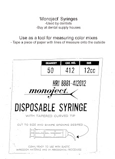
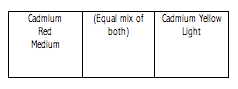
Sketchbook Exercise: In order to work towards building a full color wheel it will be useful for you to have some experience in mixing primary colors to achieve secondary colors. Use a separate page in your sketchbook to mix each of the following secondary colors.
Format:
• Label the top of each page by the exercise: “ Primary to Secondary Mixing”
• Next, list the primary color to be mixed with other primary colors as directed. [For example: Cadmium Red + three yellows (Cadmium Yellow Light, Cadmium Yellow Medium, Yellow Oxide)]
[3. Evenly spaced, 1”x3” grids per page, ]
PIGMENT PRIMARY COLORS:
Red: Cadmium Red Medium
Quinacridone Magenta
Burnt Sienna
Yellow: Cadmium Yellow Light
Cadmium Yellow Medium
Oxide Yellow
Blue: Phthalo Blue
Ultramarine Blue
Page #1 Orange Mix Cadmium Red Medium + three yellow pigments
Page #2 Orange Mix Quinacridone Magenta + three yellow pigments
Page #3 Orange Mix Burnt Sienna + three yellow pigments
Page #4 Green Mix Phthalo Blue + three yellow pigments
Page #5 Green Mix Ultramarine Blue + three yellow pigments
Page #6 Purple Mix Phthalo Blue + three red pigments
Page #7 Purple Mix Ultramarine Blue + three red pigments
1/30/09
Assignment #1
Itten Color Wheel
Directions:
Materials: 11” x 14” Bristol Board, Ruler, Compass, Protractor, Hard Pencil (2H, 4H),
Removable Tape, Xacto knife, Goldens Acrylic Paints, Brushes…
• Find the center of the top edge of your Bristol board and then measure down 7 inches. This point will be the center point of your wheel.
• Define the outer circle of the wheel to measure 10” wide and the inner circle to measure 6” wide; always use a hard 2H or 4H pencil so not to leave an indelible mark.
• From your center point, define a vertical line that spans to the top of your wheel to
create your center line.
• Define the 12 segments of your wheel: start at the centerline and measure and mark 15 degrees to the left and right of the line. This defines your yellow segment.
• The rest of the segments can simply be marked every 30 degrees. Be sure to mark on both the inner and outer circles for each segment so you can connect them in accurate radial lines (even).
• Mark the center point of every other segment after the yellow, along the inner circle. This will help you define the triangles for the center of your design.
• The triangle for the primary and secondary colors touch at the center points of marked segments.
• Be sure the primary triangle is divided evenly by measuring the center of each side and connecting that point to the center point.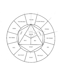
The Psychology of Color and Form
2/6/09
Sketchbook Exercise: Research how color and shapes relate to human psychology. Assign a page in your sketchbook for each color in your toolbox. In the corner you will choose a shape to represent this color based on the research you did and your own intuitions. Write down under the painted shape why you chose the shape you chose for the particular color. Save space on each page because it will be used later for your tints and shades when we look at value.
Example:

Some suggest a gray blue shows fear of new ideas, therefore, I chose a cone shapes because it recedes into the base rather than growing out from it.
Additive and Subtractive Color
http://www.sanford-artedventures.com/study/g_color_wheel.html
http://www.sanford-artedventures.com/study/g_color_wheel.html
Color Mixing - William F. Powell
Some General Guidelines
Some General Guidelines
Mixing:
The goal of this exercise is to get better acquainted with the paint in your supply kit as well as to begin developing effective skills and techniques that will be vital to your success in this class. You will need to learn how paint behaves and to better understand how you work best with it. Patience and concentration along with care will be essential to the discipline needed for this class. Once you’ve developed the necessary techniques, the work itself will be very easy to complete.
Some tips for effective mixing:
• Use care and patience
Take your time and concentrate on how the paint behaves in order to keep the paint flat and opaque. Aim for “computer print-out” or cut paper flat.
• Keep your paint mixtures consistent and smooth. Each tube may be different (thick or thin). You may need to mix a little water to keep thicker paint from appearing too lumpy. Avoid making it too watery or it will look transparent and streaky.
• Keep your brushes and water clean. Never use dirty water when mixing and always use your palette knife to mix, not brushes.
• Tape off shapes with removable tape (Scotch works well) in order to keep edges clean
• Always work in well-lit areas. Daylight is best or a combination of window/electric light is good. Certain light bulbs including fluorescents will make the color seem different.
• Remember paint usually dries darker. It always looks more vibrant and light when wet. You will need to account for this in future mixing.

Hue
The quality that distinguishes one color family from another, as red from yellow or green from blue
The quality that distinguishes one color family from another, as red from yellow or green from blue
• Hue and color are not synonyms.
Hue has only one dimension, color has three: hue, value and chroma.
Munsell system: 10 basic hue families: 5 major and 5 minor
Major hue families: Red, Yellow, Green, Blue, and Purple
Minor hue families: Yellow-Red (Orange), Green-Yellow, Blue-Green, Purple-Blue, and Red-Purple
• Hue circle- In the Munsell system this is what the circle of hues is referred to as, rather than the color wheel.
• Munsell notation for hue:
The ten hue families can be further subdivided into 10 more hue families. The number 5 designates the center- the most “true” representation of that hue family. The number 10 designates the hue family that is halfway between two adjacent “true” hues. Moving clockwise around the circle it begins with Red 1R, 2R, 3R, 4R, 5R (at the top center), 6R, 7R, 8R, 9R, 10R (yellowish red), 1Y… Even finer subdivisions can be made using decimals.
• Compliments on the hue circle differ from the popular color wheels.
1/23/09
Sketchbook Exercise: In order to work towards building a full color wheel it will be useful for you to have some experience in mixing primary colors to achieve secondary colors. Use a separate page in your sketchbook to mix each of the following secondary colors.
Format:
• Label the top of each page by the exercise: “ Primary to Secondary Mixing”
• Next, list the primary color to be mixed with other primary colors as directed. [For example: Cadmium Red + three yellows (Cadmium Yellow Light, Cadmium Yellow Medium, Yellow Oxide)]

[3. Evenly spaced, 1”x3” grids per page, ]
PIGMENT PRIMARY COLORS:
Red: Cadmium Red Medium
Quinacridone Magenta
Burnt Sienna
Yellow: Cadmium Yellow Light
Cadmium Yellow Medium
Oxide Yellow
Blue: Phthalo Blue
Ultramarine Blue
Page #1 Orange Mix Cadmium Red Medium + three yellow pigments
Page #2 Orange Mix Quinacridone Magenta + three yellow pigments
Page #3 Orange Mix Burnt Sienna + three yellow pigments
Page #4 Green Mix Phthalo Blue + three yellow pigments
Page #5 Green Mix Ultramarine Blue + three yellow pigments
Page #6 Purple Mix Phthalo Blue + three red pigments
Page #7 Purple Mix Ultramarine Blue + three red pigments
1/30/09
Assignment #1
Itten Color Wheel
Directions:
Materials: 11” x 14” Bristol Board, Ruler, Compass, Protractor, Hard Pencil (2H, 4H),
Removable Tape, Xacto knife, Goldens Acrylic Paints, Brushes…
• Find the center of the top edge of your Bristol board and then measure down 7 inches. This point will be the center point of your wheel.
• Define the outer circle of the wheel to measure 10” wide and the inner circle to measure 6” wide; always use a hard 2H or 4H pencil so not to leave an indelible mark.
• From your center point, define a vertical line that spans to the top of your wheel to
create your center line.
• Define the 12 segments of your wheel: start at the centerline and measure and mark 15 degrees to the left and right of the line. This defines your yellow segment.
• The rest of the segments can simply be marked every 30 degrees. Be sure to mark on both the inner and outer circles for each segment so you can connect them in accurate radial lines (even).
• Mark the center point of every other segment after the yellow, along the inner circle. This will help you define the triangles for the center of your design.
• The triangle for the primary and secondary colors touch at the center points of marked segments.
• Be sure the primary triangle is divided evenly by measuring the center of each side and connecting that point to the center point.
The Psychology of Color and Form
2/6/09
Sketchbook Exercise: Research how color and shapes relate to human psychology. Assign a page in your sketchbook for each color in your toolbox. In the corner you will choose a shape to represent this color based on the research you did and your own intuitions. Write down under the painted shape why you chose the shape you chose for the particular color. Save space on each page because it will be used later for your tints and shades when we look at value.
Example:

Some suggest a gray blue shows fear of new ideas, therefore, I chose a cone shapes because it recedes into the base rather than growing out from it.
Value
Value- The quality by which a light color is distinguished from a dark one, the quantity of light reflected by the color
• Often referred to as Tints or Shades
• Tint- a light color
Paint- color mixed with white paint
Watercolor- color diluted with water
Print- color made from widely placed dots (halftone)
Science- color mixed with white light
Computer- in the monitor three electron beams simulate red, blue and green phosphors to glow, tinting happens when all three beams are set comparatively high
• Shade- may indicate any dark color, or any color mixed with black
• Lightness of a color depends on the percentage of light reflected from the colored surface (lightest is white- most light is reflected, darkest is pitch black- no light is reflected. Gray- some light is partially absorbed, and partly reflected.
Grayscale
• Munsell Grayscale is divided into 10 value steps
• Munsell Notation: N (neutral) followed by a number and a / (divisor symbol)
Example- absolute black= N 0/, most black paints used in artworks and photos= N 2/, absolute white N 10/, most white paint N 9/, middle value gray- N 5/ (value of a photographer’s gray card)
• Neutral colors- without hue
• Theoretical white- absolute white
• On the Munsell scale value change is designated by a vertical scale
• Only a small amount of white paint needs to be added to make the black paint much lighter and takes a much larger amount of white paint to make a light gray appear much lighter.
• A grayscale cannot be constructed that appears uniform with equal increments of white to black or black to white are added.
• All colors that have the same Munsell value, no matter the hue reflect that same amount of light
Why value?
• In black and white photography the gradient of light and shadow on objects contain all information about form, clearly defining the objects and shows the amount and direction of light.
• Artists/ Designers create black and white preliminary sketches indication value changes for a painting or design, helping plan the relationship between light and dark areas.
• Lighting designers use preliminary drawings to plot out patterns of highlight and shadow and brightness and darkness.
2/6/09
Exercises:
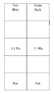
#1 In your color sketchbooks we will make Tint and Shade scales for all of your tubes of color. Each scale will have 5 sections. Begin with a grayscale. Your first color will be white, the third will be a 1:1 mix (middle gray), your last will be black and the others will fall in between. You will then make a tint scale and a shade scale for each hue.
#2 Create an 18-Step Grayscale
In order to fully understand the relationship between colors and value it is useful to begin by constructing a grayscale using black and white only. The format of this project will be 18 1.5” x 3.75” Swatches on a Bristol board. In order to gain some experience in mixing grays begin the project in your sketchbook by mixing small value swatches. Fill a page or two of the swatches and see how many subtle steps you can make between black and white. When you feel ready to move onto the 18-step grayscale begin by painting your first one out of the tube white and your last out of the tube black. The next logical step would be to mix your middle gray. After you have these three steps established mix all of the steps in between. Use your value swatches as a reference. You may have to adjust your middle gray later on in the process of completing the project. The goal of this project is to create a smooth gradation or transition from white to black. Cut your swatches out and fit them in your sketchbooks.
#3 Follow 1.2 on page 18 in Munsell. We will tape the chips together then tape them into our color sketchbooks.
#4 Try following figure 1.3 for homework. Bring your samples into class next week if possible.
2/13/09
Assignment #2
Itten Color Star
Directions:
Materials: 11” x 11” White Illustration Board, Ruler, Compass, Protractor, Hard Pencil (2H, 4H), Removable Tape, Xacto knife, Goldens Acrylic Paints, Brushes…
• Find the center of your Illustration board (5.5”) and place a point. Draw a line down the center of your board.
• From your center point you will draw 8 concentric circles using a compass. Plot a 5/8” distance for each circle beginning at the center. The measurements that will be plotted from the center outward on your line are as follows: 5/8”, 5/8”, 5/8 ”, 5/16 ”(where the star meets), 5/16”, 5/8”, 5/8”, 5/8”, 5/8 ”.
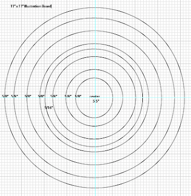
• From your center line use the outer edged of you protractor to define the 12 segments of your wheel. Start at the center line and measure and mark 15 degrees to the left and right of the line. This defines your yellow segment.
• The rest of the segments will be marked every 15 degrees. Be sure to mark on both the inner and outer circles for each segment so you can connect them in accurate radial lines (even).
• The base of your triangle will end at the ½ way between the center and the outer points.
• Paint the star matching the Itten colors and values.
Color and Design
Geometric Abstraction:
http://www.metmuseum.org/toah/hd/geab/hd_geab.htm
High Key and Low Key Painting
High Key: The painting is light or pale in value. Colors that are mixed with white ("pastels" or "tints") are high key.
Low Key: The painting is dark in value. Colors that are mixed with black ("shades") are low key.
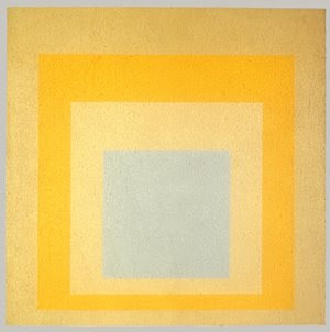
Homage to the Square: With Rays, 1959
Josef Albers (American, born Germany, 1888–1976)
Oil on Masonite; 48 1/8 x 48 1/8 in.
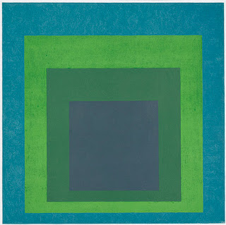
Homage to the Square: Soft Spoken, 1969
Josef Albers (American, born Germany, 1888–1976)
Oil on Masonite; 48 x 48 in.
High Key Paintings:
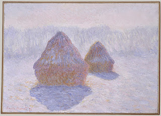
Haystacks (Effect of Snow and Sun), 1891
Claude Monet (French, 1840–1926)
Oil on canvas; 25 3/4 x 36 1/4 in.
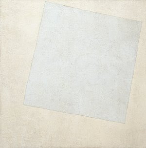 Suprematist Composition: White on White, 1918
Kazimir Malevich (Russian, 1878–1935)
Oil on canvas; 31 1/4 x 31 1/4 in.
The Museum of Modern Art, New York
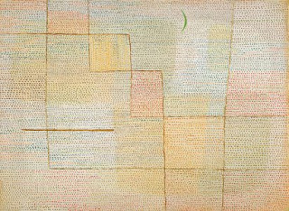
Clarification, 1932
Paul Klee (German, 1879–1940)
Oil on canvas; 27 3/4 x 37 7/8 in.
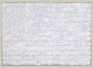
Flag, 1957
Jasper Johns (American, born 1930)
Oil on paper, mounted on paperboard; 12 x 16 3/4 in.
Low Key Paintings:
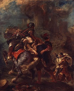
The Abduction of Rebecca, 1846
Eugène Delacroix (French, 1798–1863)
Oil on canvas; 39 1/2 x 32 1/4 in.
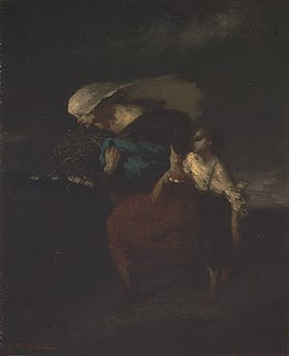
Retreat from the Storm, ca. 1846
Jean-François Millet (French, 1814–1875)
Oil on canvas; 18 1/4 x 15 in.
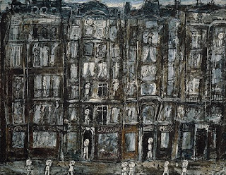
Apartment Houses, Paris, 1946
Jean Dubuffet (French, 1901–1985)
Oil with sand and charcoal on canvas; 44 7/8 x 57 3/8 in.
2/20/09
Assignment #3
Low Key/High Key Design Painting
Directions:
Materials:
14" x 8" Bristol Board/Illustration Board (preferred), Ruler, Triangle, Compass, Protractor, Hard Pencil (2H, 4H), Removable Tape, Xacto knife, Goldens Acrylic Paints, Brushes…
References- Value Swatches, Itten Star, High Key or Low Key Value Swatches
1. Begin by developing your design in your sketchbook. Create a 2 1/2” square for your design that contains two or more geometric shapes in addition to the background. This square design can range from simple to slightly more complex but, more importantly, it should be a design that can create a more interesting pattern when repeated in a grid. Consider the placement of your shapes and how the edges may create new shapes when aligned with the edges of the next square.
2. Prepare your surface: On a 14” x 8” Bristol/ illustration board tape off and define a 1 1/2" border on 4 sides to create a 11” x 5" rectangle design space. Break the rectangular space down into two 5" x 5" squares with a 1" space in between them.
3. Design: Within the drawn 5” x 5" squares, recreate your design using a ruler, compass, stencils, tracing paper and/or transfer paper for precise measurements. Divide your each square space into a 2 x 2 pattern that creates a 4 square grid. Keep your borders clean. Place your 2.5” square design repeatedly into the 2 x 2 grid composition.
4. Swatches:
• Choose colors from either the Itten Star, or your sketchbook value swatches. You will pick a minimum of 4 either low key or high key colors and their opposites on the value scale. Your first square design will be the low key colors and the second square will be the opposite high key colors. Make 1 1/2" x 1 1/2" swatches of these colors.
• When creating your 1 1/2" x 1 1/2"swatches put the paint on evenly without too much texture. Do not dilute the paint. We want to see the exact color of the pigment.
* Step back and make wise choices when picking out your palette.
•Think about how colors interact. Move the swatches around to see how the colors look next to each other and if they are not working choose new ones.
•Put your swatches and palette choice in your sketchbook.
Tips:
- Mix your paint with a palette knife
- Record on the backs of your swatches or in your sketchbooks what your mixture consists of--colors, measurements
-Add more white for a higher key (lighter end of the grayscale) painting or more black for a lower key (darker end of the grayscale) painting.
4. Painting: Choose a minimum of 4 low key colors and their opposites on the value scale (high key) that you find interesting as a color scheme from your swatches. Decide where your colors make the most sense and keep in mind how they interact. Assign colors to your design. Your paint should be opaque.
Keep your design simple. Your design should be painted in a neat and flat manner. Punctual completion, presentation and accuracy of color mixing are the primary factors in determining your grade.
• Often referred to as Tints or Shades
• Tint- a light color
Paint- color mixed with white paint
Watercolor- color diluted with water
Print- color made from widely placed dots (halftone)
Science- color mixed with white light
Computer- in the monitor three electron beams simulate red, blue and green phosphors to glow, tinting happens when all three beams are set comparatively high
• Shade- may indicate any dark color, or any color mixed with black
• Lightness of a color depends on the percentage of light reflected from the colored surface (lightest is white- most light is reflected, darkest is pitch black- no light is reflected. Gray- some light is partially absorbed, and partly reflected.
Grayscale
• Munsell Grayscale is divided into 10 value steps
• Munsell Notation: N (neutral) followed by a number and a / (divisor symbol)
Example- absolute black= N 0/, most black paints used in artworks and photos= N 2/, absolute white N 10/, most white paint N 9/, middle value gray- N 5/ (value of a photographer’s gray card)
• Neutral colors- without hue
• Theoretical white- absolute white
• On the Munsell scale value change is designated by a vertical scale
• Only a small amount of white paint needs to be added to make the black paint much lighter and takes a much larger amount of white paint to make a light gray appear much lighter.
• A grayscale cannot be constructed that appears uniform with equal increments of white to black or black to white are added.
• All colors that have the same Munsell value, no matter the hue reflect that same amount of light
Why value?
• In black and white photography the gradient of light and shadow on objects contain all information about form, clearly defining the objects and shows the amount and direction of light.
• Artists/ Designers create black and white preliminary sketches indication value changes for a painting or design, helping plan the relationship between light and dark areas.
• Lighting designers use preliminary drawings to plot out patterns of highlight and shadow and brightness and darkness.
2/6/09
Exercises:
#1 In your color sketchbooks we will make Tint and Shade scales for all of your tubes of color. Each scale will have 5 sections. Begin with a grayscale. Your first color will be white, the third will be a 1:1 mix (middle gray), your last will be black and the others will fall in between. You will then make a tint scale and a shade scale for each hue.

#2 Create an 18-Step Grayscale
In order to fully understand the relationship between colors and value it is useful to begin by constructing a grayscale using black and white only. The format of this project will be 18 1.5” x 3.75” Swatches on a Bristol board. In order to gain some experience in mixing grays begin the project in your sketchbook by mixing small value swatches. Fill a page or two of the swatches and see how many subtle steps you can make between black and white. When you feel ready to move onto the 18-step grayscale begin by painting your first one out of the tube white and your last out of the tube black. The next logical step would be to mix your middle gray. After you have these three steps established mix all of the steps in between. Use your value swatches as a reference. You may have to adjust your middle gray later on in the process of completing the project. The goal of this project is to create a smooth gradation or transition from white to black. Cut your swatches out and fit them in your sketchbooks.
#3 Follow 1.2 on page 18 in Munsell. We will tape the chips together then tape them into our color sketchbooks.
#4 Try following figure 1.3 for homework. Bring your samples into class next week if possible.
2/13/09
Assignment #2
Itten Color Star
Directions:
Materials: 11” x 11” White Illustration Board, Ruler, Compass, Protractor, Hard Pencil (2H, 4H), Removable Tape, Xacto knife, Goldens Acrylic Paints, Brushes…
• Find the center of your Illustration board (5.5”) and place a point. Draw a line down the center of your board.
• From your center point you will draw 8 concentric circles using a compass. Plot a 5/8” distance for each circle beginning at the center. The measurements that will be plotted from the center outward on your line are as follows: 5/8”, 5/8”, 5/8 ”, 5/16 ”(where the star meets), 5/16”, 5/8”, 5/8”, 5/8”, 5/8 ”.

• From your center line use the outer edged of you protractor to define the 12 segments of your wheel. Start at the center line and measure and mark 15 degrees to the left and right of the line. This defines your yellow segment.
• The rest of the segments will be marked every 15 degrees. Be sure to mark on both the inner and outer circles for each segment so you can connect them in accurate radial lines (even).
• The base of your triangle will end at the ½ way between the center and the outer points.
• Paint the star matching the Itten colors and values.
Color and Design
Geometric Abstraction:
http://www.metmuseum.org/toah/hd/geab/hd_geab.htm
High Key and Low Key Painting
High Key: The painting is light or pale in value. Colors that are mixed with white ("pastels" or "tints") are high key.
Low Key: The painting is dark in value. Colors that are mixed with black ("shades") are low key.

Homage to the Square: With Rays, 1959
Josef Albers (American, born Germany, 1888–1976)
Oil on Masonite; 48 1/8 x 48 1/8 in.

Homage to the Square: Soft Spoken, 1969
Josef Albers (American, born Germany, 1888–1976)
Oil on Masonite; 48 x 48 in.
High Key Paintings:

Haystacks (Effect of Snow and Sun), 1891
Claude Monet (French, 1840–1926)
Oil on canvas; 25 3/4 x 36 1/4 in.
 Suprematist Composition: White on White, 1918
Kazimir Malevich (Russian, 1878–1935)
Oil on canvas; 31 1/4 x 31 1/4 in.
The Museum of Modern Art, New York

Clarification, 1932
Paul Klee (German, 1879–1940)
Oil on canvas; 27 3/4 x 37 7/8 in.

Flag, 1957
Jasper Johns (American, born 1930)
Oil on paper, mounted on paperboard; 12 x 16 3/4 in.
Low Key Paintings:

The Abduction of Rebecca, 1846
Eugène Delacroix (French, 1798–1863)
Oil on canvas; 39 1/2 x 32 1/4 in.

Retreat from the Storm, ca. 1846
Jean-François Millet (French, 1814–1875)
Oil on canvas; 18 1/4 x 15 in.

Apartment Houses, Paris, 1946
Jean Dubuffet (French, 1901–1985)
Oil with sand and charcoal on canvas; 44 7/8 x 57 3/8 in.
2/20/09
Assignment #3
Low Key/High Key Design Painting

Directions:
Materials:
14" x 8" Bristol Board/Illustration Board (preferred), Ruler, Triangle, Compass, Protractor, Hard Pencil (2H, 4H), Removable Tape, Xacto knife, Goldens Acrylic Paints, Brushes…
References- Value Swatches, Itten Star, High Key or Low Key Value Swatches
1. Begin by developing your design in your sketchbook. Create a 2 1/2” square for your design that contains two or more geometric shapes in addition to the background. This square design can range from simple to slightly more complex but, more importantly, it should be a design that can create a more interesting pattern when repeated in a grid. Consider the placement of your shapes and how the edges may create new shapes when aligned with the edges of the next square.
2. Prepare your surface: On a 14” x 8” Bristol/ illustration board tape off and define a 1 1/2" border on 4 sides to create a 11” x 5" rectangle design space. Break the rectangular space down into two 5" x 5" squares with a 1" space in between them.
3. Design: Within the drawn 5” x 5" squares, recreate your design using a ruler, compass, stencils, tracing paper and/or transfer paper for precise measurements. Divide your each square space into a 2 x 2 pattern that creates a 4 square grid. Keep your borders clean. Place your 2.5” square design repeatedly into the 2 x 2 grid composition.
4. Swatches:
• Choose colors from either the Itten Star, or your sketchbook value swatches. You will pick a minimum of 4 either low key or high key colors and their opposites on the value scale. Your first square design will be the low key colors and the second square will be the opposite high key colors. Make 1 1/2" x 1 1/2" swatches of these colors.
• When creating your 1 1/2" x 1 1/2"swatches put the paint on evenly without too much texture. Do not dilute the paint. We want to see the exact color of the pigment.
* Step back and make wise choices when picking out your palette.
•Think about how colors interact. Move the swatches around to see how the colors look next to each other and if they are not working choose new ones.
•Put your swatches and palette choice in your sketchbook.
Tips:
- Mix your paint with a palette knife
- Record on the backs of your swatches or in your sketchbooks what your mixture consists of--colors, measurements
-Add more white for a higher key (lighter end of the grayscale) painting or more black for a lower key (darker end of the grayscale) painting.
4. Painting: Choose a minimum of 4 low key colors and their opposites on the value scale (high key) that you find interesting as a color scheme from your swatches. Decide where your colors make the most sense and keep in mind how they interact. Assign colors to your design. Your paint should be opaque.
Keep your design simple. Your design should be painted in a neat and flat manner. Punctual completion, presentation and accuracy of color mixing are the primary factors in determining your grade.
Chroma
Chroma
The strength or intensity of a color, the quality by which we distinguish a strong color from a weak or dull one, the amount of departure of a color from a gray of the same degree of lightness
Chroma involves the intensity and purity level in a hue that can range from fully saturated to infinite levels of neutrality.
• Neutralized or grayish colors show weak (LOW) chroma
• Intense colors show strong (HIGH) chroma
-Often referred to as bright (indicating a combination of lightness and chroma) or saturated (viewed by Munsell as a combination of value and chroma)
-Painters use the term saturation to indicate the relative proportion of pigment to filler, or medium, in paint.
-A saturated color is one with a strong chroma
• Easy to confuse chroma and value
- With chroma it is possible to have a series of colors that gradually become grayer, without becoming darker
• Hue and value scales have a definite beginning and end while chroma scales can be
extended indefinitely
-Number of chroma steps depends on the hue (more steps between gray and red than blue and red)
• Each pigment has it’s own strength and reacts differently when combined with other
pigments that will weaken it
-Pigment is most saturated when it comes directly out of the tube.
• Munsell Notation
-Chroma is noted in number form as the dividend in the Munsell hue/value/chroma notation
- Together the hue is written as a whole number followed by a letter denoting the color name followed by the value number placed over the chroma number in the form of a fraction (example- 5R 4/14)
• Color Solid- Developed in the 1600s, color systems displayed in some kind of geometric
shape, the three dimensions- hue, value, chroma take a three dimensional form in an arrangement of all colors
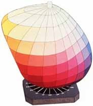
http://www.coloracademy.co.uk/ColorAcademy%202006/subjects/munsell/page3.htm
• Color Gamut- The entire range of colors—all the possible variations in hue, value, and
chroma that can be achieved in a medium or material
-Chroma defines the color range attainable in a particular medium
-The medium affects the possible number of chroma steps
Experiment with several ways to lower the chroma in these exercises in order to better control and manipulate color for your needs in the future.
Three main ways to lower chroma are:
-Tint with white
-Shade with black
-Add the compliment
2/27/09
Sketchbook Exercises
#1 Create 3 saturation gradation scales that evenly take the primary colors from their fully saturated state into their compliment. Each 1”x7” grid will start with a saturated primary (like on your color wheel) on the left side and the saturated compliment on the extreme right with the center square being the neutral middle chroma, equally between them and not closer to either saturated parent color.
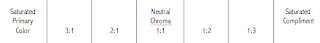
Saturated primary, then 3 parts primary & one part compliment…then, 2 parts primary to one part compliment… then, one to one (even) making a neutral gray that is neither closer to one or the other saturated colors…
#2 Create another three transitions of the primaries to compliment colors while tinting them with white. Choose from your grayscales a level of light that is closer to white.

#3 Create another three transitions of the primaries to compliment colors while shading them with black. Choose from your grayscale a level of light that is closer to a dark gray and yet a level that still allows for the color to be recognizable.
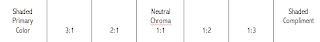
Remember to label these Chroma Studies
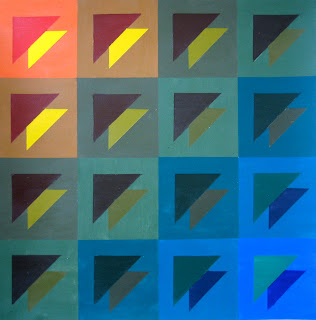
Assignment #4
Saturated/ Neutral Transition Design
Student Samples
Directions:
Materials:
11" x 11" Bristol Board or 12" x 12"Illustration Board (preferred), Ruler, Triangle, Compass, Protractor, Hard Pencil (2H, 4H), Removable Tape, Xacto knife, Goldens Acrylic Paints, Brushes…
References- Chroma/Saturation scales
Saturation or Chroma: relates to the degree of purity of a color. Contrast of saturation is the contrast between pure, intense colors and dull, diluted colors.
1. Begin by developing your design in your sketchbook. Create a 2.5” square for your design that contains two or more geometric shapes in addition to the background. This square design can range from simple to slightly more complex but, more importantly, it should be a design that can create a more interesting pattern when repeated in a grid. Consider the placement of your shapes and how the edges may create new shapes when aligned with the edges of the next square.
2. Prepare your surface: On a 12”x12” illustration board tape off and define a 1" border on 4 sides to create a 10” square design space or on an 11” x 11” Bristol board and define a 1/2" border on 4 sides.
3. Design: Within the drawn 10” square, recreate your design using a ruler, compass, stencils, tracing paper and/or transfer paper for precise measurements. Divide your space into a 4 x 4 pattern that creates a 16 square grid. Keep your borders clean. When placing your 2.5” square design into the 4x4 grid composition, you may opt to rotate or flip (mirror image) the design square in order to create a more visually interesting design.
4. Painting: Choose 3 pairs of complement 7-step transitions that you find interesting as a color scheme from the chroma studies in your sketchbook. At least one must be a saturated transition. Your goal is to work diagonally from one corner to the opposite corner of the grid. So you need to assign a color (transition) to each shape in your repeated 2.5” square (including background areas as a shape).
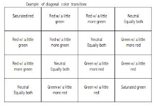
For example: if your design was a simple circle and a square inside the 2.5” square, the background would consist of one of your designated transitions and shift from one color to the opposite in 7 steps- corner to corner. Likewise, the circle in the corner square would start as the beginning color of another chosen transition and then become the compliment of that color in a smooth transition towards the opposite corner. The square will transition in the same way.
Your transitions should happen in 7 steps, so you will work diagonally from one corner to another. Background color transitions and shape color transitions may change in the same or different diagonal paths (For example: maybe the background color goes from top left to bottom right while the shape (s) in the square design transforms into it’s compliment from top right to bottom left).
Keep your design simple. Your design should be painted in a neat and flat manner. Punctual completion, presentation and accuracy of color mixing are the primary factors in determining your grade.
Using Hue, Value and Chroma
Assignment #5
Equal Value/ Invisible Painting
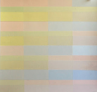
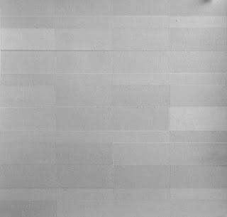
Student Sample
Directions:
Materials:
11" x 11" Bristol Board or 12" x 12"Illustration Board (preferred), Ruler, Triangle, Compass, Protractor, Hard Pencil (2H, 4H), Removable Tape, Xacto knife, Goldens Acrylic Paints, Brushes…
References- Value scales, Itten star, Munsell Color Chart Pages, Chroma scales
1. Begin by developing your design in your sketchbook. Create a 2.5” square for your design that contains two or more geometric shapes in addition to the background. This square design can range from simple to slightly more complex but, more importantly, it should be a design that can create a more interesting pattern when repeated in a grid. Consider the placement of your shapes and how the edges may create new shapes when aligned with the edges of the next square.
2. Prepare your surface: On a 12”x12” illustration board tape off and define a 1" border on 4 sides to create a 10” square design space or on an 11” x 11” Bristol board and define a 1/2" border on 4 sides.
3. Design: Within the drawn 10” square, recreate your design using a ruler, compass, stencils, tracing paper and/or transfer paper for precise measurements. Divide your space into a 4 x 4 pattern that creates a 16 square grid. Keep your borders clean. When placing your 2.5” square design into the 4x4 grid composition, you may opt to rotate or flip (mirror image) the design square in order to create a more visually interesting design.
4. Value: Choose a single value for your design by looking at your grayscale and color chip charts in the Munsell text. If you normally tend to work in high key (lighter end of the grayscale), middle key (middle values of the grayscale) or low key (darker end of the grayscale) it would be wise to choose a different value for this exercise. The object of the assignment is to create a simple, yet interesting, design that is composed of at least 10 colors that are all the same in value.
You can vary your palette with different hues and variations of hues. You can alter the chroma (saturation) of them as long as you maintain a single value for the design. Adding black and white will be necessary to generate your targeted value. Remember, adding a compliment to a color may lower the chroma without dramatically changing the value level.
The idea is that you produce an outcome that could be photographed in black and white, or scanned into the computer in grayscale, and it would appear somewhat invisible. * Because of the nature of film and Xerox machines, this is more theory than consistent fact.
Keep your design simple. Your design should be painted in a neat and flat manner. Punctual completion, presentation and accuracy of color mixing are the primary factors in determining your grade.
The strength or intensity of a color, the quality by which we distinguish a strong color from a weak or dull one, the amount of departure of a color from a gray of the same degree of lightness
Chroma involves the intensity and purity level in a hue that can range from fully saturated to infinite levels of neutrality.
• Neutralized or grayish colors show weak (LOW) chroma
• Intense colors show strong (HIGH) chroma
-Often referred to as bright (indicating a combination of lightness and chroma) or saturated (viewed by Munsell as a combination of value and chroma)
-Painters use the term saturation to indicate the relative proportion of pigment to filler, or medium, in paint.
-A saturated color is one with a strong chroma
• Easy to confuse chroma and value
- With chroma it is possible to have a series of colors that gradually become grayer, without becoming darker
• Hue and value scales have a definite beginning and end while chroma scales can be
extended indefinitely
-Number of chroma steps depends on the hue (more steps between gray and red than blue and red)
• Each pigment has it’s own strength and reacts differently when combined with other
pigments that will weaken it
-Pigment is most saturated when it comes directly out of the tube.
• Munsell Notation
-Chroma is noted in number form as the dividend in the Munsell hue/value/chroma notation
- Together the hue is written as a whole number followed by a letter denoting the color name followed by the value number placed over the chroma number in the form of a fraction (example- 5R 4/14)
• Color Solid- Developed in the 1600s, color systems displayed in some kind of geometric
shape, the three dimensions- hue, value, chroma take a three dimensional form in an arrangement of all colors

http://www.coloracademy.co.uk/ColorAcademy%202006/subjects/munsell/page3.htm
• Color Gamut- The entire range of colors—all the possible variations in hue, value, and
chroma that can be achieved in a medium or material
-Chroma defines the color range attainable in a particular medium
-The medium affects the possible number of chroma steps
Experiment with several ways to lower the chroma in these exercises in order to better control and manipulate color for your needs in the future.
Three main ways to lower chroma are:
-Tint with white
-Shade with black
-Add the compliment
2/27/09
Sketchbook Exercises
#1 Create 3 saturation gradation scales that evenly take the primary colors from their fully saturated state into their compliment. Each 1”x7” grid will start with a saturated primary (like on your color wheel) on the left side and the saturated compliment on the extreme right with the center square being the neutral middle chroma, equally between them and not closer to either saturated parent color.

Saturated primary, then 3 parts primary & one part compliment…then, 2 parts primary to one part compliment… then, one to one (even) making a neutral gray that is neither closer to one or the other saturated colors…
#2 Create another three transitions of the primaries to compliment colors while tinting them with white. Choose from your grayscales a level of light that is closer to white.

#3 Create another three transitions of the primaries to compliment colors while shading them with black. Choose from your grayscale a level of light that is closer to a dark gray and yet a level that still allows for the color to be recognizable.

Remember to label these Chroma Studies
Assignment #4
Saturated/ Neutral Transition Design


Student Samples
Directions:
Materials:
11" x 11" Bristol Board or 12" x 12"Illustration Board (preferred), Ruler, Triangle, Compass, Protractor, Hard Pencil (2H, 4H), Removable Tape, Xacto knife, Goldens Acrylic Paints, Brushes…
References- Chroma/Saturation scales
Saturation or Chroma: relates to the degree of purity of a color. Contrast of saturation is the contrast between pure, intense colors and dull, diluted colors.
1. Begin by developing your design in your sketchbook. Create a 2.5” square for your design that contains two or more geometric shapes in addition to the background. This square design can range from simple to slightly more complex but, more importantly, it should be a design that can create a more interesting pattern when repeated in a grid. Consider the placement of your shapes and how the edges may create new shapes when aligned with the edges of the next square.
2. Prepare your surface: On a 12”x12” illustration board tape off and define a 1" border on 4 sides to create a 10” square design space or on an 11” x 11” Bristol board and define a 1/2" border on 4 sides.
3. Design: Within the drawn 10” square, recreate your design using a ruler, compass, stencils, tracing paper and/or transfer paper for precise measurements. Divide your space into a 4 x 4 pattern that creates a 16 square grid. Keep your borders clean. When placing your 2.5” square design into the 4x4 grid composition, you may opt to rotate or flip (mirror image) the design square in order to create a more visually interesting design.
4. Painting: Choose 3 pairs of complement 7-step transitions that you find interesting as a color scheme from the chroma studies in your sketchbook. At least one must be a saturated transition. Your goal is to work diagonally from one corner to the opposite corner of the grid. So you need to assign a color (transition) to each shape in your repeated 2.5” square (including background areas as a shape).

For example: if your design was a simple circle and a square inside the 2.5” square, the background would consist of one of your designated transitions and shift from one color to the opposite in 7 steps- corner to corner. Likewise, the circle in the corner square would start as the beginning color of another chosen transition and then become the compliment of that color in a smooth transition towards the opposite corner. The square will transition in the same way.
Your transitions should happen in 7 steps, so you will work diagonally from one corner to another. Background color transitions and shape color transitions may change in the same or different diagonal paths (For example: maybe the background color goes from top left to bottom right while the shape (s) in the square design transforms into it’s compliment from top right to bottom left).
Keep your design simple. Your design should be painted in a neat and flat manner. Punctual completion, presentation and accuracy of color mixing are the primary factors in determining your grade.
Using Hue, Value and Chroma
Assignment #5
Equal Value/ Invisible Painting


Student Sample
Directions:
Materials:
11" x 11" Bristol Board or 12" x 12"Illustration Board (preferred), Ruler, Triangle, Compass, Protractor, Hard Pencil (2H, 4H), Removable Tape, Xacto knife, Goldens Acrylic Paints, Brushes…
References- Value scales, Itten star, Munsell Color Chart Pages, Chroma scales
1. Begin by developing your design in your sketchbook. Create a 2.5” square for your design that contains two or more geometric shapes in addition to the background. This square design can range from simple to slightly more complex but, more importantly, it should be a design that can create a more interesting pattern when repeated in a grid. Consider the placement of your shapes and how the edges may create new shapes when aligned with the edges of the next square.
2. Prepare your surface: On a 12”x12” illustration board tape off and define a 1" border on 4 sides to create a 10” square design space or on an 11” x 11” Bristol board and define a 1/2" border on 4 sides.
3. Design: Within the drawn 10” square, recreate your design using a ruler, compass, stencils, tracing paper and/or transfer paper for precise measurements. Divide your space into a 4 x 4 pattern that creates a 16 square grid. Keep your borders clean. When placing your 2.5” square design into the 4x4 grid composition, you may opt to rotate or flip (mirror image) the design square in order to create a more visually interesting design.
4. Value: Choose a single value for your design by looking at your grayscale and color chip charts in the Munsell text. If you normally tend to work in high key (lighter end of the grayscale), middle key (middle values of the grayscale) or low key (darker end of the grayscale) it would be wise to choose a different value for this exercise. The object of the assignment is to create a simple, yet interesting, design that is composed of at least 10 colors that are all the same in value.
You can vary your palette with different hues and variations of hues. You can alter the chroma (saturation) of them as long as you maintain a single value for the design. Adding black and white will be necessary to generate your targeted value. Remember, adding a compliment to a color may lower the chroma without dramatically changing the value level.
The idea is that you produce an outcome that could be photographed in black and white, or scanned into the computer in grayscale, and it would appear somewhat invisible. * Because of the nature of film and Xerox machines, this is more theory than consistent fact.
Keep your design simple. Your design should be painted in a neat and flat manner. Punctual completion, presentation and accuracy of color mixing are the primary factors in determining your grade.
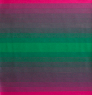
Temperature
Color Temperature:
The Munsell text states: ‘there seems to be a universal perception that some hues seem warm while others seem cool. It is a perceived red or yellow content that makes a hue seem warm and a blue content that makes a hue seem cool.” When referring to the color wheel, notice that it can be divided into two distinct temperature ranges: warm and cool. The colors yellow, yellow-orange, orange, red-orange, red and red-violet appear as our warm colors. The colors yellow-green, green, blue-green, blue, blue-violet and violet are relatively cooler.
3/13/09
Read Chapter 5: Color Anomalies, Preference, and Emotional Response in the Munsell text for further discussion.
3/13/09
Sketchbook Exercise: Explore a minimum of 6 colors ( 3 sets of transitions, 1" x 8" grids) in your sketchbook by mixing a range of the same hue creating a warm to cool transition. Example- consider a warm yellow (leaning towards a yellow –orange) and create a full gamut of color ranging to a cooler, green-yellow. Shifts can be subtle but smooth, creating a fluid transition. Do this with a number of colors until you feel comfortable with a choice for the next composition.


Student Sample
Warm to Cool Transition
3/13/09
Assignment #6 Color Temperature
Directions:
Materials:
12" x 12"Illustration Board, Ruler, Triangle, Compass, Protractor, Hard Pencil (2H, 4H), Removable Tape, Xacto knife, Goldens Acrylic Paints, Brushes…
References- Temperature transition scales
You will be creating a 5x5 grid consisting of 2” squares on a 12” square illustration board with a 1” border along the parameter. Design a motif (repeated pattern) of shapes that will serve as a vehicle for a gradation change of a color from warm to cool.
Gradation: The transition of your color temperature change should occur diagonally (from one corner to another) in nine steps. Diagonal pattern of color transition is similar to that of your Chroma/Saturation design.
Example:
The accurate display of your ability to change the temperature of a color painted in a clean, flat manner is important.
Student Sample
Advancing and Receding Colors:
It is important to note that the warm colors generally appear to pull forward in space and cool colors appear to recede. Warm colors are often times used to describe light while cool colors are used to describe shadow or lack of light. The spatial effect color temperature produces in a composition can be utilized if mixed and placed in proper context.
3/13/09
Sketchbook Exercise:
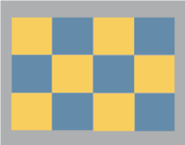
1. From Munsell, page 54: Try the following on the computer (use a drawing program such as Illustrator). Create a checkerboard pattern of warm and cool colored squares. Open a blank screen and change the background color from white to middle gray. Draw 12 squares of similar size, about 1” x 1” each. Drag the squares and arrange them in a checkerboard pattern. Select half of the squares, every other in the pattern (multiple selection of items is usually possibly by depressing and holding the shift key while selecting.) Fill these squares with a warm, light, vivid color such as bright yellow. Select the other 6 squares and fill them with a cool, dark, dull color such as dark blue-gray. Then select all 12 squares and change the black lines defining the squares to “no line.” View the colored checkerboard pattern from a distance. Which squares seem closer in distance, the warm, light, vivid color or the cool, dark dull color? Print it out and place it in your sketchbooks.
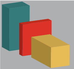
2. Use a page in your sketchbooks to create a composition of shapes using one-point perspective. Demonstrate the effect of accurate color on depth perception with paint. Example: If you were to draw a cube, the face would receive the most amount of light and be the strongest color. The top would be a slightly darker, grayer version of that color. The side that receives the least amount of light would be the darkest and most gray version of that color. Overlap shapes to further the appearance of objects advancing and receding in your composition. Keep in mind the warm colors tend to advance and cool recede.
The Munsell text states: ‘there seems to be a universal perception that some hues seem warm while others seem cool. It is a perceived red or yellow content that makes a hue seem warm and a blue content that makes a hue seem cool.” When referring to the color wheel, notice that it can be divided into two distinct temperature ranges: warm and cool. The colors yellow, yellow-orange, orange, red-orange, red and red-violet appear as our warm colors. The colors yellow-green, green, blue-green, blue, blue-violet and violet are relatively cooler.
3/13/09
Read Chapter 5: Color Anomalies, Preference, and Emotional Response in the Munsell text for further discussion.
3/13/09
Sketchbook Exercise: Explore a minimum of 6 colors ( 3 sets of transitions, 1" x 8" grids) in your sketchbook by mixing a range of the same hue creating a warm to cool transition. Example- consider a warm yellow (leaning towards a yellow –orange) and create a full gamut of color ranging to a cooler, green-yellow. Shifts can be subtle but smooth, creating a fluid transition. Do this with a number of colors until you feel comfortable with a choice for the next composition.


Student Sample
Warm to Cool Transition
3/13/09
Assignment #6 Color Temperature
Directions:
Materials:
12" x 12"Illustration Board, Ruler, Triangle, Compass, Protractor, Hard Pencil (2H, 4H), Removable Tape, Xacto knife, Goldens Acrylic Paints, Brushes…
References- Temperature transition scales
You will be creating a 5x5 grid consisting of 2” squares on a 12” square illustration board with a 1” border along the parameter. Design a motif (repeated pattern) of shapes that will serve as a vehicle for a gradation change of a color from warm to cool.
Gradation: The transition of your color temperature change should occur diagonally (from one corner to another) in nine steps. Diagonal pattern of color transition is similar to that of your Chroma/Saturation design.
Example:

The accurate display of your ability to change the temperature of a color painted in a clean, flat manner is important.

Student Sample
Advancing and Receding Colors:
It is important to note that the warm colors generally appear to pull forward in space and cool colors appear to recede. Warm colors are often times used to describe light while cool colors are used to describe shadow or lack of light. The spatial effect color temperature produces in a composition can be utilized if mixed and placed in proper context.
3/13/09
Sketchbook Exercise:
1. From Munsell, page 54: Try the following on the computer (use a drawing program such as Illustrator). Create a checkerboard pattern of warm and cool colored squares. Open a blank screen and change the background color from white to middle gray. Draw 12 squares of similar size, about 1” x 1” each. Drag the squares and arrange them in a checkerboard pattern. Select half of the squares, every other in the pattern (multiple selection of items is usually possibly by depressing and holding the shift key while selecting.) Fill these squares with a warm, light, vivid color such as bright yellow. Select the other 6 squares and fill them with a cool, dark, dull color such as dark blue-gray. Then select all 12 squares and change the black lines defining the squares to “no line.” View the colored checkerboard pattern from a distance. Which squares seem closer in distance, the warm, light, vivid color or the cool, dark dull color? Print it out and place it in your sketchbooks.

2. Use a page in your sketchbooks to create a composition of shapes using one-point perspective. Demonstrate the effect of accurate color on depth perception with paint. Example: If you were to draw a cube, the face would receive the most amount of light and be the strongest color. The top would be a slightly darker, grayer version of that color. The side that receives the least amount of light would be the darkest and most gray version of that color. Overlap shapes to further the appearance of objects advancing and receding in your composition. Keep in mind the warm colors tend to advance and cool recede.

Simultaneous Contrast
•Michel- Eugene Chevereul, The Law of Simultaneous Contrast of Colors
Chevereul’s Analysis: Colors are modified in appearance by their proximity to other colors.
The Magic of Simultaneous Contrast
http://jozmak.blogspot.com/2007/03/magic-of-simultaneous-contrast.html
Example of simultaneous contrast:
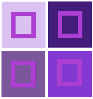
Look at the effects of adjacent colors. A color will appear darker in value on a light ground and lighter on a dark ground, more intense on a more neutral ground and grayer on a very intense ground. Orange will look more or orange on a field of red and more red on a field of yellow.

http://char.txa.cornell.edu/language/element/color/color.htm
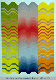
Some of the bands extend from the center panel to intrude into areas of contrasting hue in the side panels. These extended bands are in fact the same hue and value throughout, but appear to change from left to right.
•Successive Contrast happens when a given color is viewed in one environment (one color background) and then in another in quick succession. The color will be modified relative to these new surroundings as illustrated in the figure below (http://www.blogger.com/Successive%20contrast%20happens%20when%20a%20given%20color%20is%20viewed%20in%20one%20environment%20%28one%20color%20background%29%20and%20then%20in%20another%20in%20quick%20succession.%20The%20color%20will%20be%20modified%20relative%20to%20these%20new%20surroundings%20as%20illustrated%20in%20the%20figure%20below%20%28http://personal.uncc.edu/lagaro/cwg/color/color_percept.html%29.).
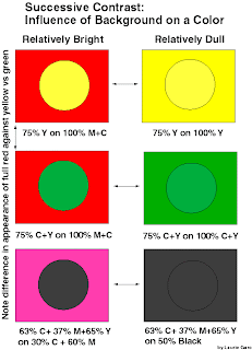
"Bezold Effect" is when a given color will appear darker and brighter when surrounded by black, and softer and less bright when surrounded by white.
Afterimage is an optical illusion that refers to an image continuing to appear in one's vision after the exposure to the original image has ceased (Wikipedia).
Afterimage test:
http://radio.weblogs.com/0101365/stories/2003/06/27/afterImageTest.html
Interactions of color:
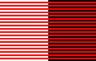
All colors seem lighter and more dramatic against black.
All colors seem cooler and more subdued against white.
Dark colors look darker against light colors than against dark colors.
Light colors look lighter against dark colors than against light colors.
Colors are influenced in hue by adjacent colors, each coloring its neighbor with its own
compliment.
If two compliment colors lay side by side, the contrast makes each look more
intense than it looks by itself.
Dark hues on a dark background that is not complimentary appear weaker, or less
intense, then they do on a complimentary background.
Light colors on a light background that is not complimentary appear weaker, or
less intense than they do on a complimentary background.
A bright color set against a dull color of the same hue deadens the dull color.
When a bright color is set against a dull color, the contrast is strongest when the
latter is complimentary.
Light colors on light backgrounds that are not complimentary can be strengthened
if bounded by narrow bands of black or of complimentary colors.
Dark colors on dark backgrounds that are not complimentary can be greatly
strengthened if bounded by narrow white or complimentary colors.
The greatest afterimage appears when figure and background relationships have
the same value , and when a large background is set behind a small foreground figure.
Afterimage- an afterimage is an optical illusion that refers to an image continuing to
appear in one's vision after the exposure to the original image has ceased (Wikipedia).
Color Vision & Art
http://www.webexhibits.org/colorart/contrast.html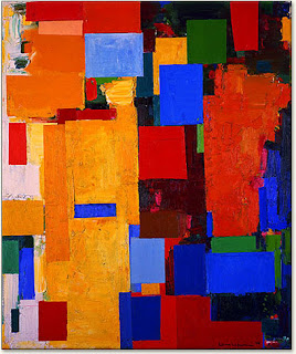
3/27/09
Assignment #7
Simultaneous Contrast Design Painting
Directions:
Select from the above interactions of color to create a pair of designs that show simultaneous contrast.
Materials:
14" x 8" Bristol Board/Illustration Board (preferred), Ruler, Triangle, Compass, Protractor, Hard Pencil (2H, 4H), Removable Tape, Xacto knife, Goldens Acrylic Paints, Brushes…
References- All swatches from the semester can be referred to for color ideas.
1. Begin by developing your design in your sketchbook. Create a 2 1/2” square for your design that contains two or more geometric shapes in addition to the background. This square design can range from simple to slightly more complex but, more importantly, it should be a design that can create a more interesting pattern when repeated in a grid. Consider the placement of your shapes and how the edges may create new shapes when aligned with the edges of the next square. Consider using tessellations.
2. Prepare your surface: On a 14” x 8” Bristol/ illustration board tape off and define a 1 1/2" border on 4 sides to create a 11” x 5" rectangle design space. Break the rectangular space down into two 5" x 5" squares with a 1" space in between them.
3. Design: Within the drawn 5” x 5" squares, recreate your design using a ruler, compass, stencils, tracing paper and/or transfer paper for precise measurements. Divide your each square space into a 2 x 2 pattern that creates a 4 square grid. Keep your borders clean. Place your 2.5” square design repeatedly into the 2 x 2 grid composition.
4. Swatches:
• Choose colors from any of your swatch scales, the Itten wheel or star. Color choices and how many are used will be based on which interaction of color you choose to present. Make 1 1/2" x 1 1/2" swatches of these colors and place them in your sketchbook next to your design.
• When creating your 1 1/2" x 1 1/2"swatches put the paint on evenly without too much texture. Do not dilute the paint. We want to see the exact color of the pigment.
Tips:
* Step back and make wise choices when picking out your palette.
*Think about how colors interact. Move the swatches around to see how the colors look next to each other and if they are not working choose new ones.
*Put your swatches and palette choice in your sketchbook.
*Mix your paint with a palette knife
*Record on the backs of your swatches or in your sketchbooks what your mixture consists of--colors, measurements
4. Painting: Choose colors based on the interaction you plan to show. Decide where your colors make the most sense and focus on how they interact. Assign colors to your design. Your paint should be opaque.
Keep your design simple. Your design should be painted in a neat and flat manner. Punctual completion, presentation and accuracy of color mixing are the primary factors in determining your grade.
Design:
Tessellations:
A tessellation is a design that combines art and math. It is a design made from a shape repeated over and over and that fits into itself on all sides. Some geometric shapes tessellate and fit together perfectly.
Tessellations. org
http://www.tessellations.org/index.htm
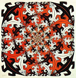
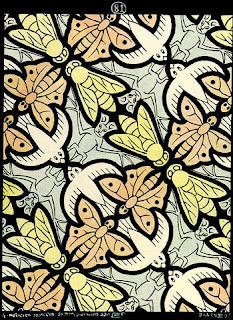
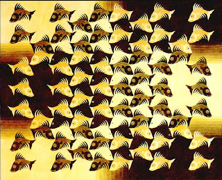
Film: The Fantastic World of M.C. Escher
Tesselation
To make a tessellation you need to create a pattern of repeating shapes which leaves no spaces or overlaps between its pieces. Tessellations are made by reflecting (flipping), translating (sliding) and rotating (turning) the two-dimensional shape or shapes that you choose to use. Your choice of colours for each of the shapes adds further beauty to your design.
http://www.cap.nsw.edu.au/bb_site_intro/stage2_Modules/tesselations/tesselations.htm
Tesselation Handout
http://mathforum.org/sum95/suzanne/whattess.html
http://www2.spsu.edu/math/tile/grammer/
http://tessellations.org/index.htm
Chevereul’s Analysis: Colors are modified in appearance by their proximity to other colors.
The Magic of Simultaneous Contrast
http://jozmak.blogspot.com/2007/03/magic-of-simultaneous-contrast.html
Example of simultaneous contrast:
Look at the effects of adjacent colors. A color will appear darker in value on a light ground and lighter on a dark ground, more intense on a more neutral ground and grayer on a very intense ground. Orange will look more or orange on a field of red and more red on a field of yellow.


Primary hues that are pure and intense are not much affected by adjacent hues but subdued colors and colors that are not primary can change appearance drastically.

Size may influence the effect of simultaneous contrast.
In most cases, larger areas of color have more influence on smaller areas of color. The small orange square is changed by the color of the red or yellow field (the ground) and not vice versa.
Color, Value and Hue:http://char.txa.cornell.edu/language/element/color/color.htm

Some of the bands extend from the center panel to intrude into areas of contrasting hue in the side panels. These extended bands are in fact the same hue and value throughout, but appear to change from left to right.
•Successive Contrast happens when a given color is viewed in one environment (one color background) and then in another in quick succession. The color will be modified relative to these new surroundings as illustrated in the figure below (http://www.blogger.com/Successive%20contrast%20happens%20when%20a%20given%20color%20is%20viewed%20in%20one%20environment%20%28one%20color%20background%29%20and%20then%20in%20another%20in%20quick%20succession.%20The%20color%20will%20be%20modified%20relative%20to%20these%20new%20surroundings%20as%20illustrated%20in%20the%20figure%20below%20%28http://personal.uncc.edu/lagaro/cwg/color/color_percept.html%29.).

"Bezold Effect" is when a given color will appear darker and brighter when surrounded by black, and softer and less bright when surrounded by white.

Afterimage is an optical illusion that refers to an image continuing to appear in one's vision after the exposure to the original image has ceased (Wikipedia).
Afterimage test:
http://radio.weblogs.com/0101365/stories/2003/06/27/afterImageTest.html
Interactions of color:
All colors seem lighter and more dramatic against black.
All colors seem cooler and more subdued against white.
Dark colors look darker against light colors than against dark colors.
Light colors look lighter against dark colors than against light colors.
Colors are influenced in hue by adjacent colors, each coloring its neighbor with its own
compliment.
If two compliment colors lay side by side, the contrast makes each look more
intense than it looks by itself.
Dark hues on a dark background that is not complimentary appear weaker, or less
intense, then they do on a complimentary background.
Light colors on a light background that is not complimentary appear weaker, or
less intense than they do on a complimentary background.
A bright color set against a dull color of the same hue deadens the dull color.
When a bright color is set against a dull color, the contrast is strongest when the
latter is complimentary.
Light colors on light backgrounds that are not complimentary can be strengthened
if bounded by narrow bands of black or of complimentary colors.
Dark colors on dark backgrounds that are not complimentary can be greatly
strengthened if bounded by narrow white or complimentary colors.
The greatest afterimage appears when figure and background relationships have
the same value , and when a large background is set behind a small foreground figure.
Afterimage- an afterimage is an optical illusion that refers to an image continuing to
appear in one's vision after the exposure to the original image has ceased (Wikipedia).
Color Vision & Art
http://www.webexhibits.org/colorart/contrast.html

3/27/09
Assignment #7
Simultaneous Contrast Design Painting
Directions:
Select from the above interactions of color to create a pair of designs that show simultaneous contrast.
Materials:
14" x 8" Bristol Board/Illustration Board (preferred), Ruler, Triangle, Compass, Protractor, Hard Pencil (2H, 4H), Removable Tape, Xacto knife, Goldens Acrylic Paints, Brushes…
References- All swatches from the semester can be referred to for color ideas.
1. Begin by developing your design in your sketchbook. Create a 2 1/2” square for your design that contains two or more geometric shapes in addition to the background. This square design can range from simple to slightly more complex but, more importantly, it should be a design that can create a more interesting pattern when repeated in a grid. Consider the placement of your shapes and how the edges may create new shapes when aligned with the edges of the next square. Consider using tessellations.
2. Prepare your surface: On a 14” x 8” Bristol/ illustration board tape off and define a 1 1/2" border on 4 sides to create a 11” x 5" rectangle design space. Break the rectangular space down into two 5" x 5" squares with a 1" space in between them.
3. Design: Within the drawn 5” x 5" squares, recreate your design using a ruler, compass, stencils, tracing paper and/or transfer paper for precise measurements. Divide your each square space into a 2 x 2 pattern that creates a 4 square grid. Keep your borders clean. Place your 2.5” square design repeatedly into the 2 x 2 grid composition.
4. Swatches:
• Choose colors from any of your swatch scales, the Itten wheel or star. Color choices and how many are used will be based on which interaction of color you choose to present. Make 1 1/2" x 1 1/2" swatches of these colors and place them in your sketchbook next to your design.
• When creating your 1 1/2" x 1 1/2"swatches put the paint on evenly without too much texture. Do not dilute the paint. We want to see the exact color of the pigment.
Tips:
* Step back and make wise choices when picking out your palette.
*Think about how colors interact. Move the swatches around to see how the colors look next to each other and if they are not working choose new ones.
*Put your swatches and palette choice in your sketchbook.
*Mix your paint with a palette knife
*Record on the backs of your swatches or in your sketchbooks what your mixture consists of--colors, measurements
4. Painting: Choose colors based on the interaction you plan to show. Decide where your colors make the most sense and focus on how they interact. Assign colors to your design. Your paint should be opaque.
Keep your design simple. Your design should be painted in a neat and flat manner. Punctual completion, presentation and accuracy of color mixing are the primary factors in determining your grade.
Design:
Tessellations:
A tessellation is a design that combines art and math. It is a design made from a shape repeated over and over and that fits into itself on all sides. Some geometric shapes tessellate and fit together perfectly.
Tessellations. org
http://www.tessellations.org/index.htm


Film: The Fantastic World of M.C. Escher
Tesselation
To make a tessellation you need to create a pattern of repeating shapes which leaves no spaces or overlaps between its pieces. Tessellations are made by reflecting (flipping), translating (sliding) and rotating (turning) the two-dimensional shape or shapes that you choose to use. Your choice of colours for each of the shapes adds further beauty to your design.
http://www.cap.nsw.edu.au/bb_site_intro/stage2_Modules/tesselations/tesselations.htm
Tesselation Handout
http://mathforum.org/sum95/suzanne/whattess.html
http://www2.spsu.edu/math/tile/grammer/
http://tessellations.org/index.htm
Subscribe to:
Posts (Atom)